CRMT Digital
Established in 1999, CRMT Digital (CRMT) is the first-ever Marketing Operations agency, helping B2B organisations build, optimise and run world-class Marketing Operations functions.
Visit SiteBackground
CRMT recognised that its current positioning was outdated, built on ‘global enablement – smart engagement’ which failed to articulate its value proposition and was addressing its specific audience in 2022. Chaptr was invited to respond to an RFP, which would set the tone for a complete overhaul of its brand strategy, visual identity and website.
CRMT told us that they were an experienced, knowledgeable and approachable agency but that their brand and website just didn’t convey any of that.
Challenge accepted.
The Brief
The first part of the brief pertained to brand strategy and communication. The objective was to create a strong and compelling proposition, tagline, tone of voice and visual brand identity that would speak clearly and directly to CRMT’s target personas.
The second part of the brief was to create a reinvented user experience and website design, informed by the new brand position and visual identity, to become the centre of inbound marketing activity and a place to promote thought leadership content to inspire and educate marketing leaders. The scope included a significant content migration exercise, a technical integration with Hubspot, a need for gated content, and an intelligent content tagging system – all built within a fully content-managed WordPress platform.

Understanding
The project kick-off session involved a full discovery workshop which, as a result, changed the initial direction of the project through a collaborative thinking process that included strategic questions and ideas to help ensure the overall success. As a result, the brief expanded with an additional need for a looping character animation and supporting brand collateral.
Now clear on what needed to be delivered and by when – we assembled an expert team from our network of trusted partners to ensure value and specialist attention was delivered to each element of the brief.
The Brand Manifesto
We worked with our expert brand strategists, Outliers, to understand and articulate CRMT’s new value proposition. The manifesto itself contained valuable information about the brand mission, vision and purpose as well as the brand personally, ladder, customer drivers, tone of voice, key brand messages, positioning statement and, importantly, how to apply the new brand in the real world. The whole team was impressed by and related to the new tagline:
CRMT Digital – Unlocking Marketing Value.

User Experience
The success of a project is often determined in the early stages, the discovery, the research, the preparation and equally importantly the user experience (UX). CRMT offer a lot of services and has a lot of resources. Hence, our job was to create a layout and content hierarchy capable of presenting this information without overwhelming or confusing the people that visit the website. This was a crucial phase for the project and the result of the UX workshop was a complete overhaul of the way CRMT positioned and structured its offering. We streamlined user flows to reduce drop-offs and increase engagement.
Deliverables – We identified the key goals and functions of the new site and we created a sitemap to illustrate the new web pages on the site and wireframes of each page, highlighting the page layout and placement of content and new user flows.
A New, Digital Identity
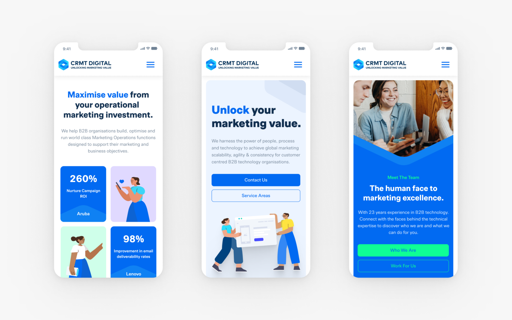
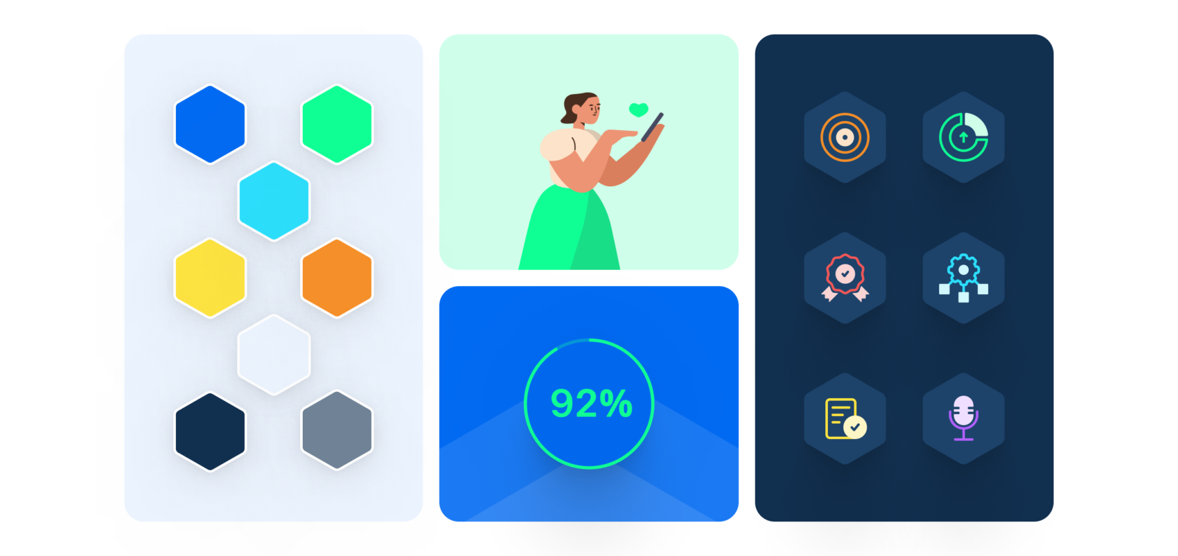
We wanted to create a design that exuded an agency vibe; modern, forward-thinking, experienced and confident but not pretentious. We wanted to move away from corporate and informative and towards relevant and engaging. Starting with the existing brand, we modernised the colour palette by adding saturation and vibrancy to the primary colour palette and introducing an extended secondary palette of supporting colours. We ditched the old typeface and replaced it with a modern sans-serif that’s highly legible and easily applied, with some unique and memorable characteristics. Though the logo wasn’t changed drastically, the complete lockup was changed to feature the new tagline.

Icons, Illustrations and the Logo Mark
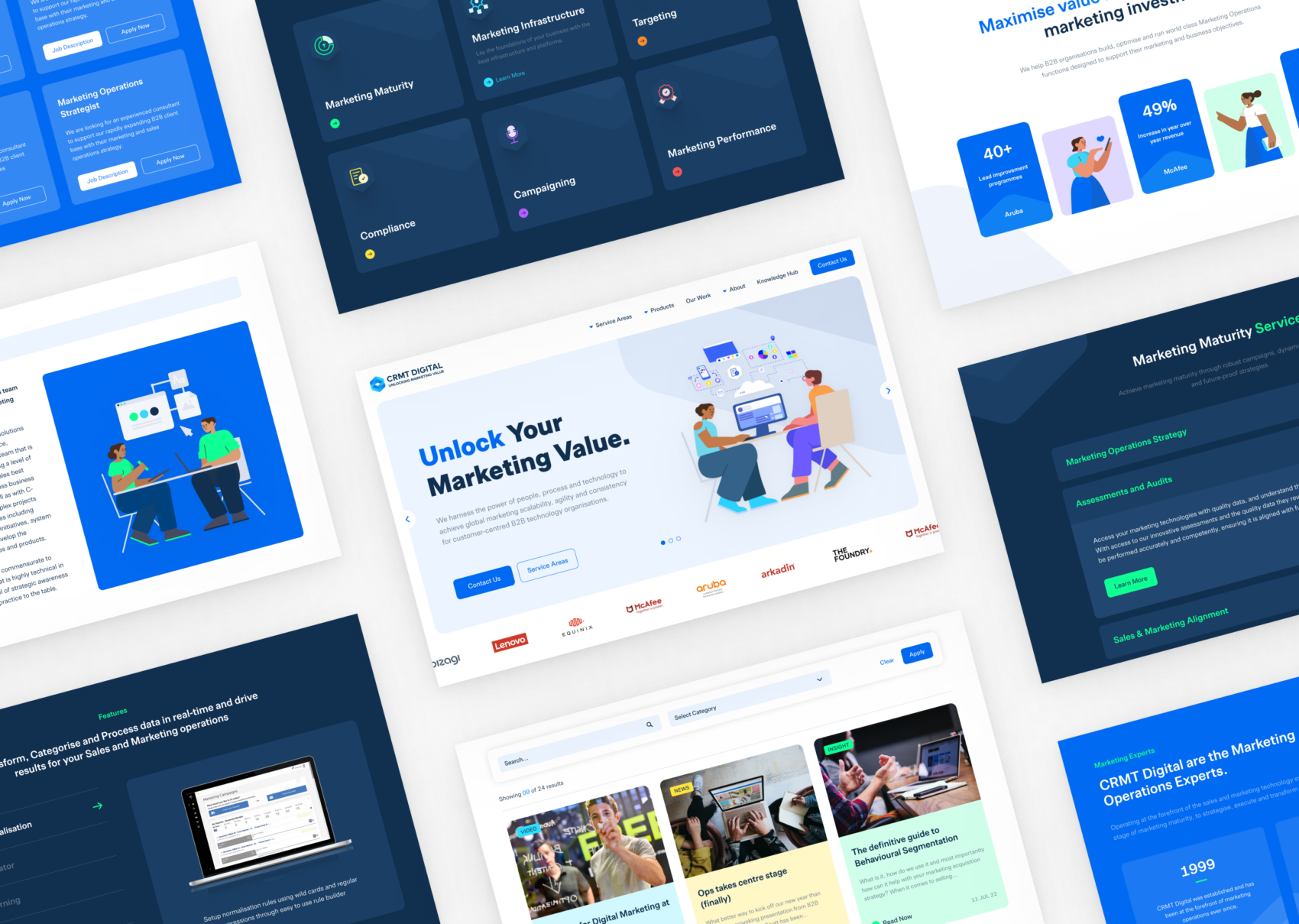
We knew from the wireframes that the site was going to contain quite a large amount of copy and be relatively scarce of imagery. Usually, a balanced combination of the two allows users to consume information effectively. So it was essential that we found ways to assist the user’s consumption of the written content without depending entirely on supporting imagery. We designed a bespoke library of iconography, used throughout the site to help emphasise key features and content. These were accompanied by a sourced illustration suite, styled to match the CRMT brand and reapplied to fit the context of relevant sections of copy. We also turned the hexagonal logo mark into a graphical device that was overlaid on top of background colours and content cards to add a recurring uniqueness to the site.
A Universal Design System
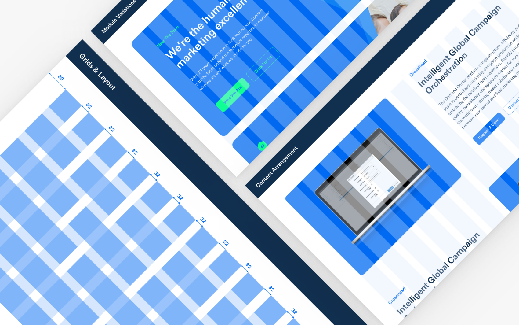
The key to the success of any design system is one that’s easy to continuously apply. For CRMT, developing a system that was not only visually stunning but consistent and efficient in its application was key. One of the main reasons for this is that the site utilises many reusable components and modules, each requiring a range of colour themes and adapting to various content options. In order for these reusable modules to be unique in their content and application and remain consistent and harmonious with the overall site style, it was essential that we followed the rules set in the design system.

The Animation
It was felt that a playful and eye-catching looping animation would help CRMT grab attention, create visual interest, effectively showcase its brand and bring to life the new tagline: ‘unlocking marketing value. The animated characters featured form part of the brand’s new visual identity and a wider dynamic design system of iconography and illustrations used throughout the website. We delivered this in collaboration with our trusted animation partner, Morever.
Deliverables – 15 second looping character animation.
Search Engine Optimisation (SEO)
The SEO strategy for this project was centred around the migration. We wanted to minimise the SEO impact of having a new website and to do that we needed to consider all the legacy ranking factors by crawling the old website to create our baseline. From this, we could plan the content migration (which articles to keep or ditch) and URL mapping. Once completed we could run an audit of the new site and fix any critical issues ahead of resubmission to search engines. This was an important and challenging aspect of the project which required a big spreadsheet, a lot of manpower and overtime (with pizza) to manually update URLs, keywords and page titles before the deadline in accordance with SEO best practices.
Web Development
Utilising a new development process specifically for this project, our developers and designers worked together closely to deliver a fully editable, user-friendly website utilising the Gutenberg block editor. A variety of custom blocks were created to meet the client’s needs including a custom frame-by-frame animation and a variety of embedded PDFs.
