Cyclehoop
With the largest rental network of secure residential cycle parking in the world, Cyclehoop has installed and now manages 11,045 cycle parking spaces across the UK since 2008; helping cities become more cycle-friendly, healthy and sustainable. Their products and services range from Site Survey and Cycle Parking Audits, Installation and Maintenance to Bespoke Product Design and more.
Visit Site
Background
Cyclehoop wanted to form a relationship with a creative web agency to deliver a new and modern design of their website to reflect their leading market position and support their expansion to the US and beyond.
The Brief, Brief
Cyclehoop needed a new website to better communicate its proposition, improve the user experience and showcase its catalogue of products to help increase sales online. This included the introduction of a new design system, a refined layout, new fonts and a bespoke iconography set for good measure. Plus a full integration with WooCommerce; a customisable, open-source eCommerce platform built on WordPress.
All our projects start with a kickoff meeting between the key project stakeholders. We confirm our understanding of the brief, clarify the goals and fill any knowledge gaps. Then we agree on key project milestones to support the successful delivery of the website.
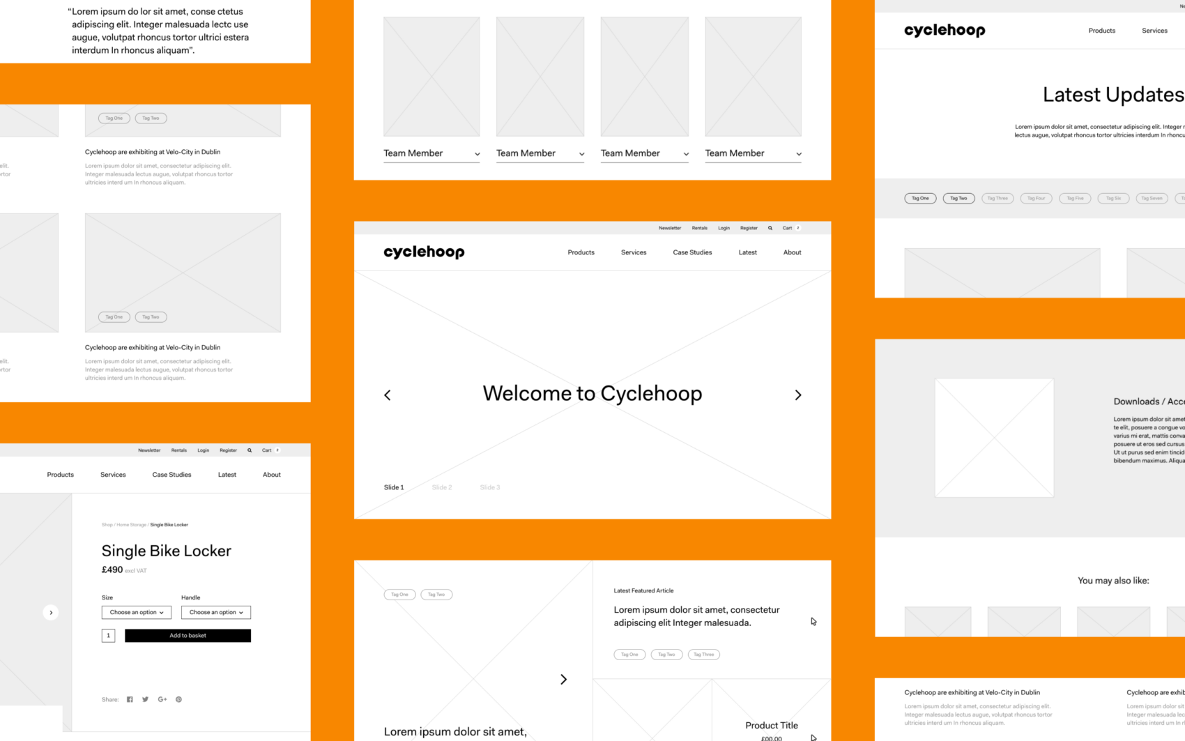
Website considerations
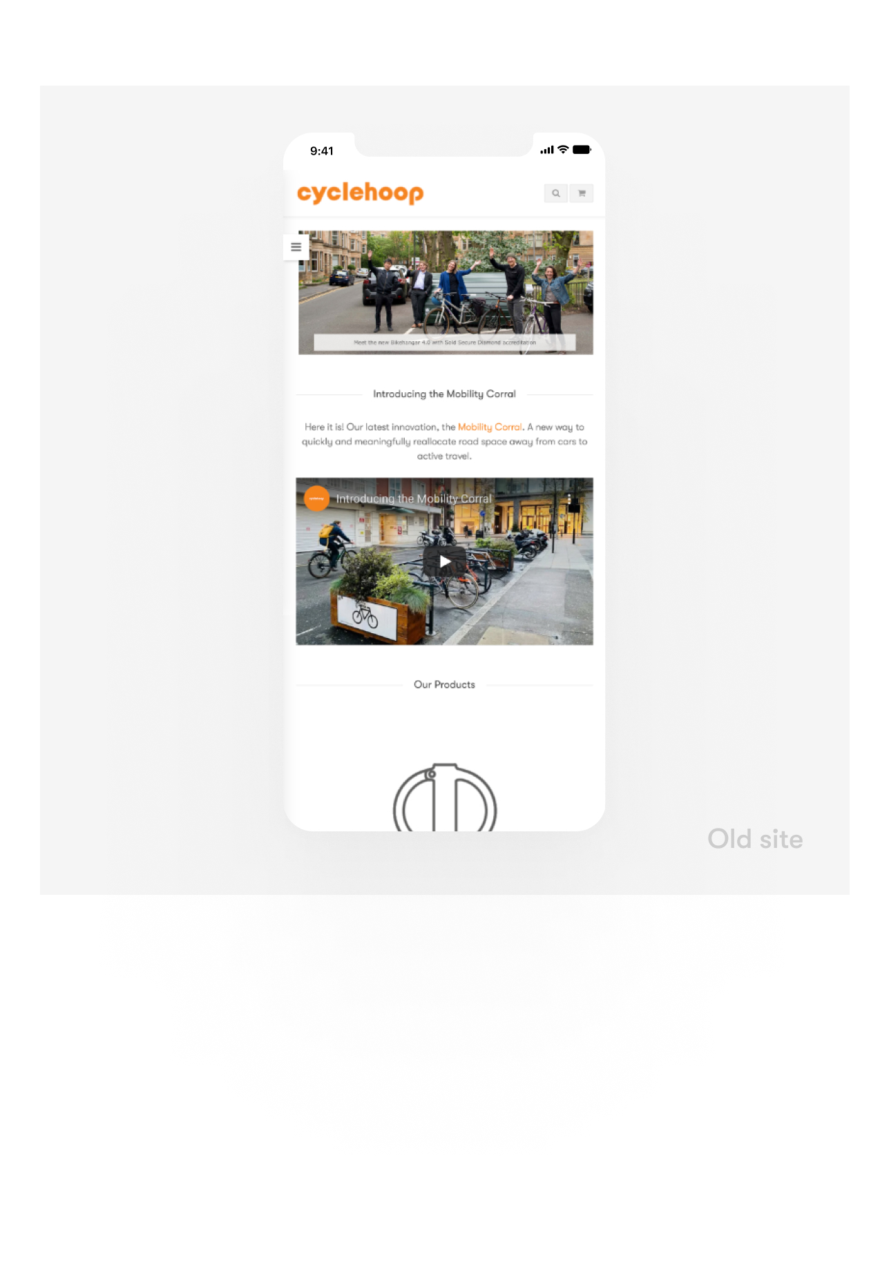
We analysed Cylcehoop’s current website to see how we could improve the user journey and quickly identified a requirement to improve the discoverability of their services and products.
In conjunction with key project objectives and through collaboration with stakeholders, we mapped out our proposed solutions through wireframes to ensure an impactful solution.
- A clear roadmap for services and products.
- Revised navigation for easier UX.
- Modern purchasing process.
Web design
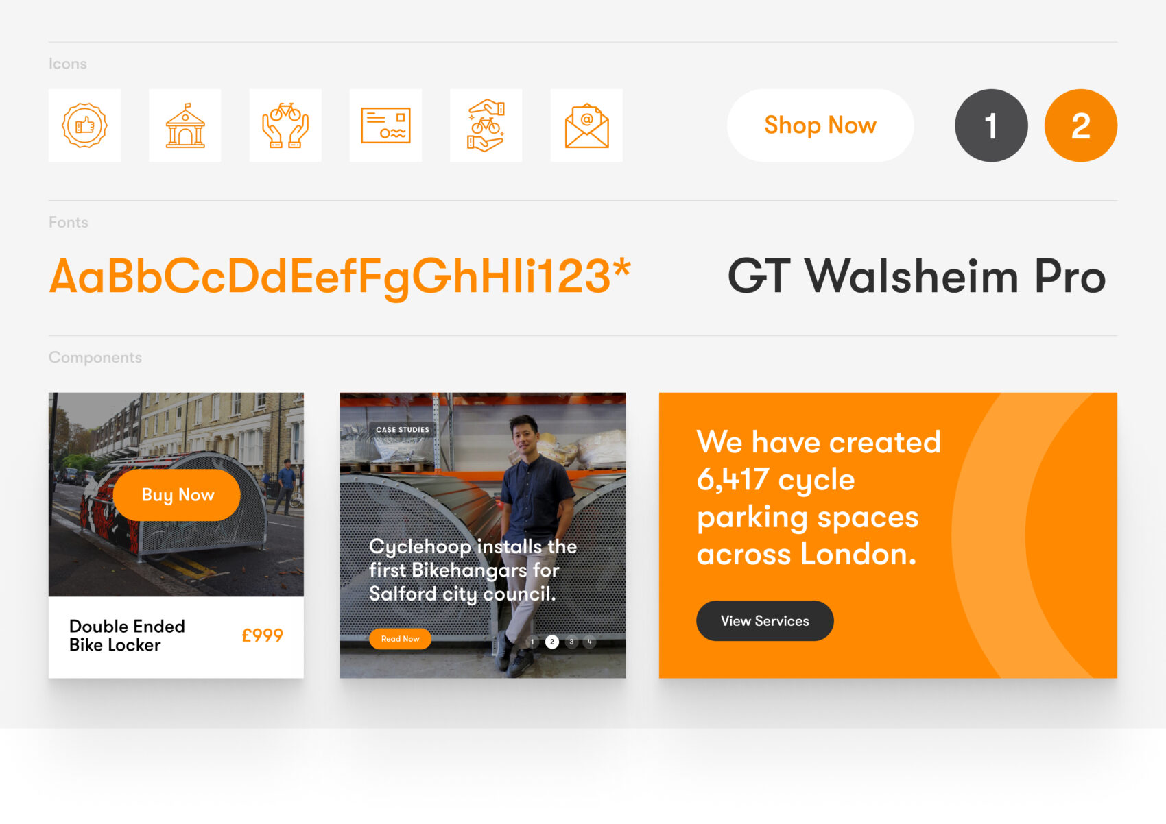
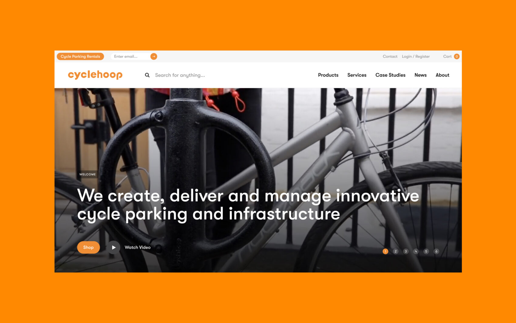
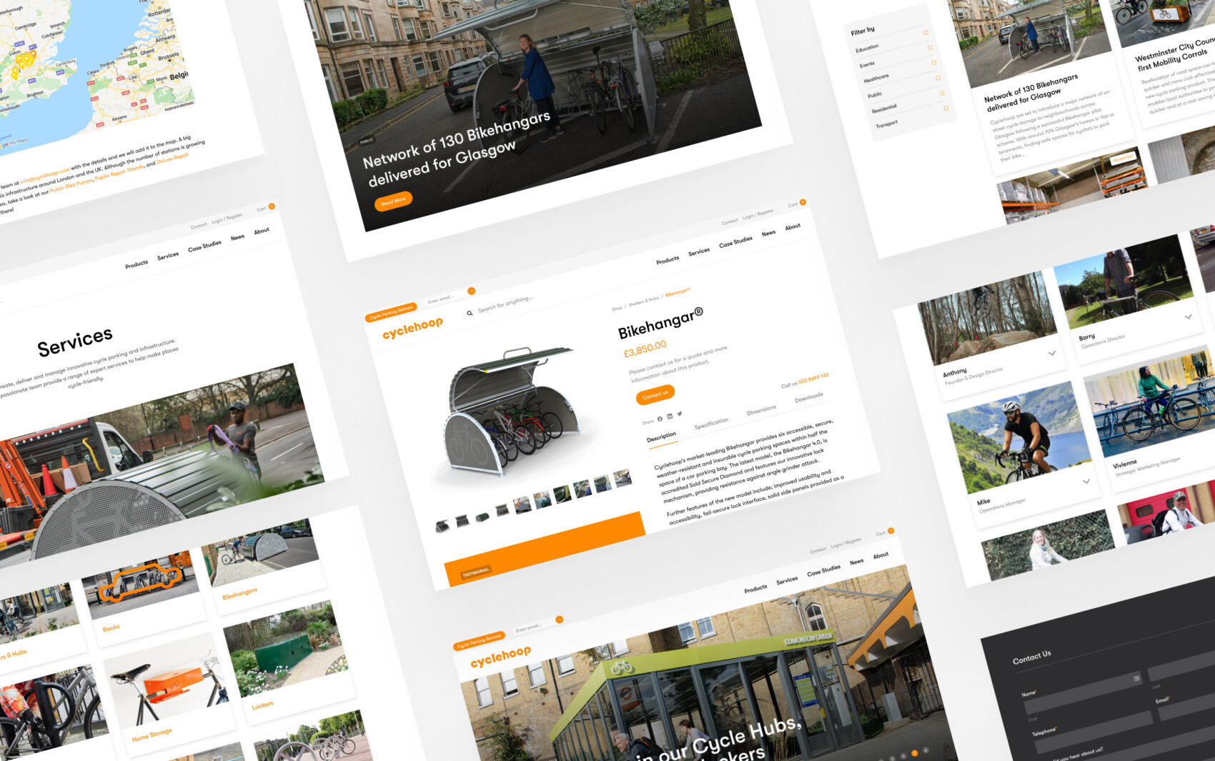
Inspired by the revised branding for Cyclehoop, we wanted the website design to be inspiring for cycling enthusiasts. So we made the products and services the focus, through high-quality photography applied to a clean layout. We applied the use of clear and concise messaging in line with Cyclehoop’s brand language to engage and build trust with customers.
Defining the digital branding
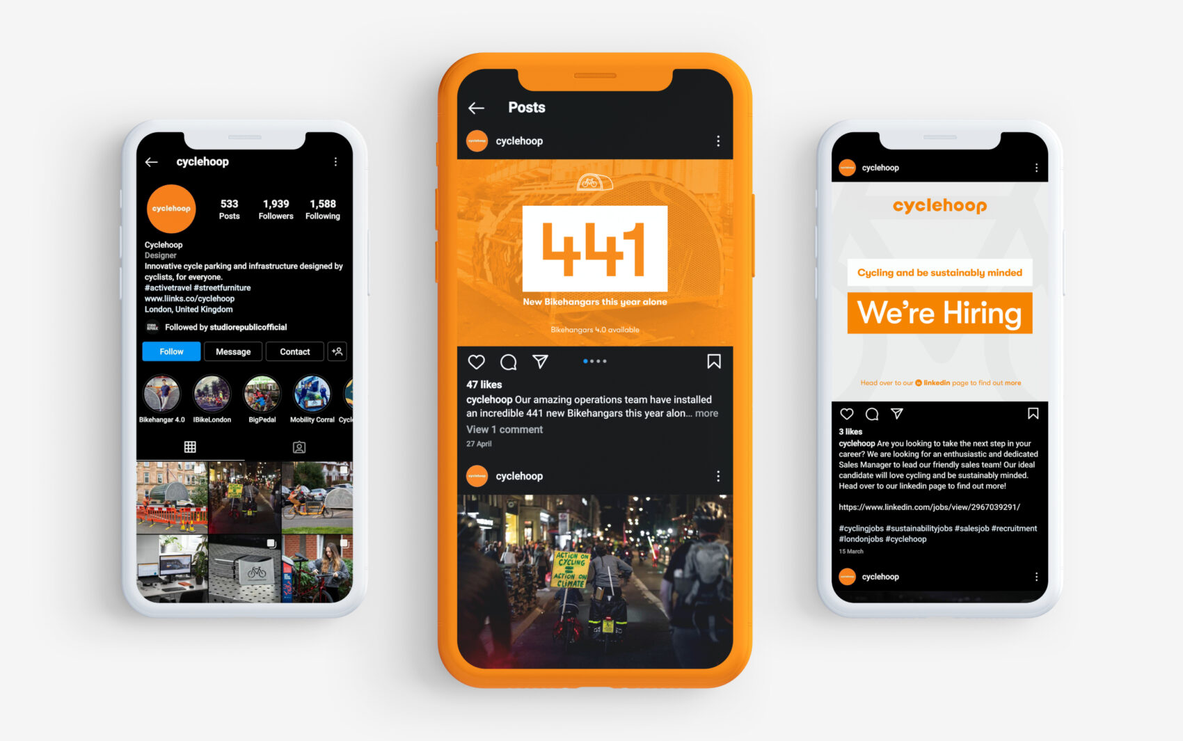
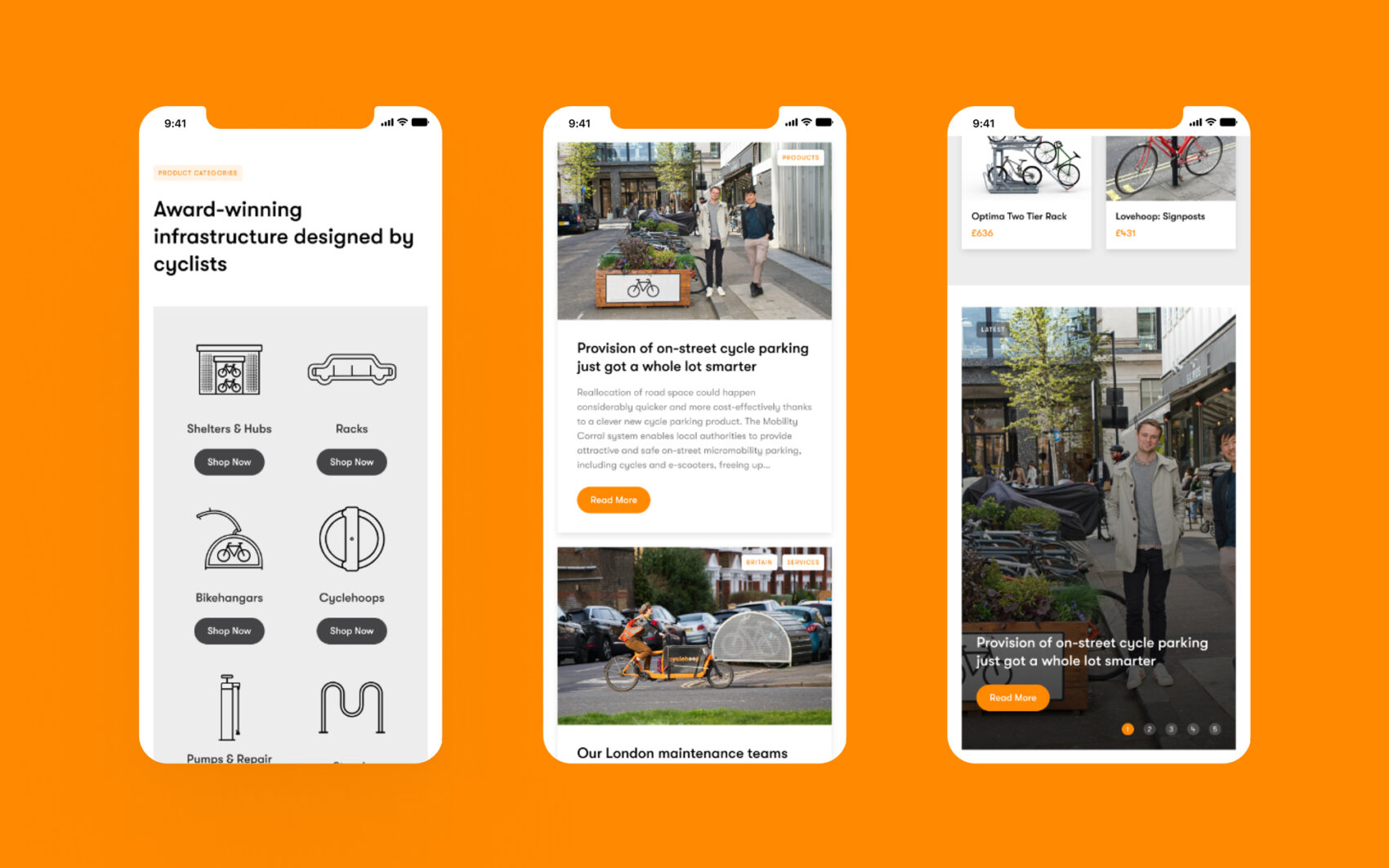
It was important to us that the new brand was consistently represented across digital devices. We developed a strong digital design system that we felt was integral to showcasing the brand at its highest standard, elevating its digital profile to build trust with its target audience as seen in the examples above.
Target Audience
Since launching in 2008 Cyclehoop has gained experience with public and commercial organisations across all sectors in the UK and internationally. The brand designs, deliver and manage a high-quality range of products, from cycle shelters and hubs to accessories, racks and stands – appealing to a wide audience.
Clarity through simplification
Too often websites are bloated, with an avalanche of information and no clear direction. So when designing the new website for Cyclehoop, our aim was to make it easy for the team to promote new products through the site and easy for the customers to find and purchase them. Matching the functionality to the purchasing needs was a challenge we enjoyed.
Search Engine Optimisation (SEO)
Search Engine Optimisation (SEO) is a core consideration for any new website project at Chaptr. It also underpins our Creative Partnerships strategy. For us, SEO isn’t just about keyword research and page load times. It’s about getting into the mind of our client’s target audiences, understanding their needs, thought patterns and online behaviour, and tailoring the digital experiences we create accordingly.
Our SEO efforts for Cyclehoop have focused on three key areas:
- Understanding who our audience is and what they need from the website. We achieved this through in-depth keyword and search trend analysis to gain deeper insight into what people understand about the brand and the offering, how they search for these products and services, and what search queries relate to the content.
- Ensuring the content was optimised and readable. We worked with Cyclehoop on the content provided to ensure it matched current usability and readability standards, making it as usable and engaging as possible.
- Considering our global audience. Part of the excitement with this project for us at Chaptr is the global launch of an incredible brand. In addition to local UK-based SEO considerations, we’re working with Cyclehoop to launch their global presence online, considering the needs and behaviours of different audiences across the world, and tailoring online experiences accordingly.
Web Development
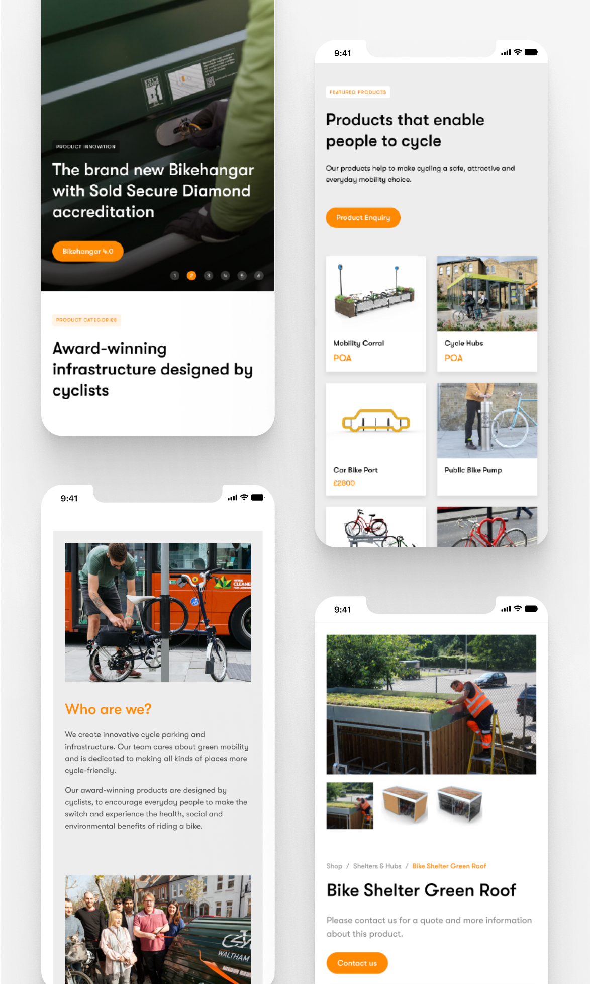
Our development team worked closely with our designers to bring the website to life. The outcome works seamlessly across a range of modern browsers, devices, and different screen sizes. We’re proud of the bespoke shop and product template created utilising a CSS framework. The result is a modern website and CMS that the client can update with ease, without the need for agency support.
Technical Integrations
Powering over 5 million websites across the globe, WooCommerce is a popular software choice for eCommerce and the perfect platform to power the new-look Cyclehoop website. We also developed a systematic approach to updating new products, using intuitive methods to save our client time through spreadsheet imports for multiple product uploads or changes.
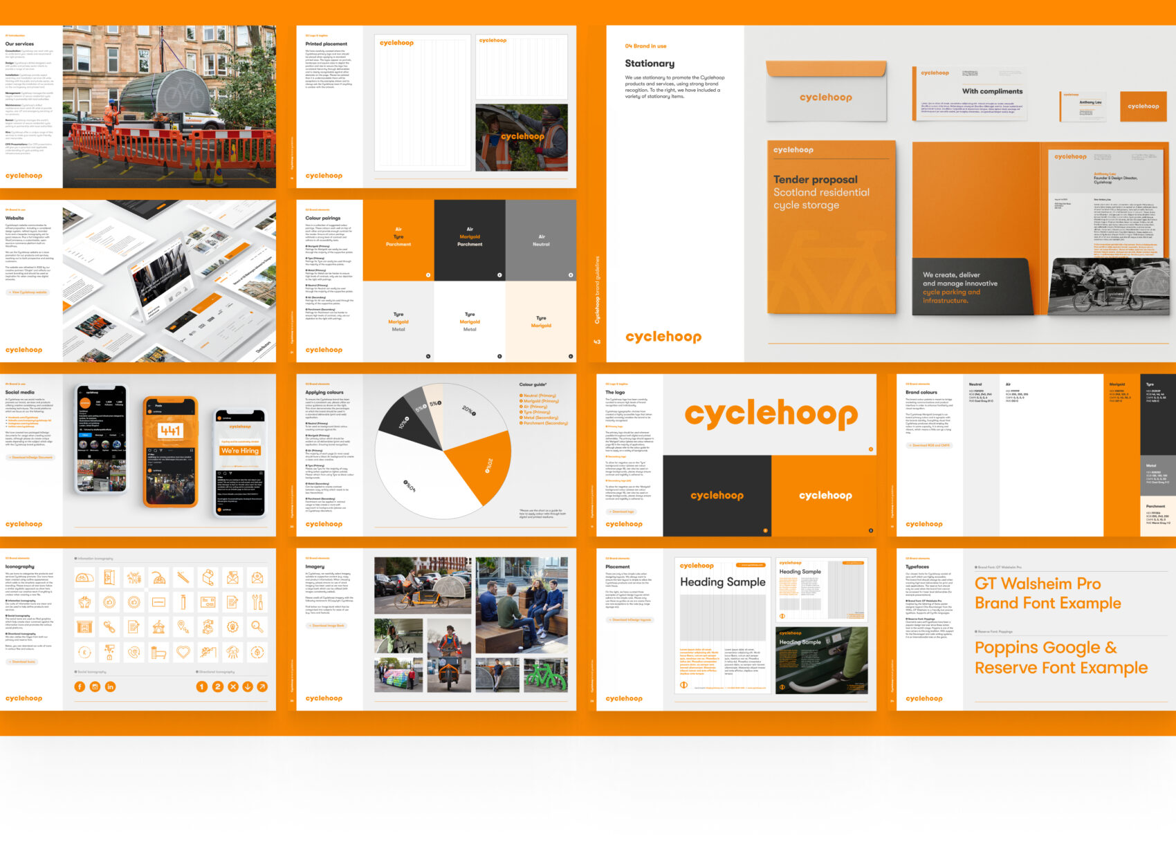
We enjoyed crafting professional brand guidelines to determine how the digital and printed creative should be represented. Cyclehoop has grown into an international award-winning brand so visual consistency is more important than ever to instil brand awareness in the public eye and maintain a professional image across all brand touch points.
Strategy for brand guidelines
Considering the brand guidelines, we collaborated with Cyclehoop to understand the creative standards integral to their communication strategy. Initially proposing pagination for the guidelines presented the opportunity to add or remove necessary pages. Once approved, our team researched modern techniques to deliver a high standard of brand guidelines, including a digital library containing essential templates and files which makes the ongoing creative process seamless.
Setting the brand standard
Defining clear standards for the usage and application of the Cyclehoop brand ensures consistency across all outputs. The guidelines outline elements from colour to typographic usage; detailing the intended application for all graphic elements. Within the guidelines, you’ll find the established brand tone; encapsulating the personality and values. Cyclehoop works across multiple regions so the guidelines form the backbone for all creative outputs ensuring they are instantly recognisable across the globe.
Understanding the brand
We created a strong digital branding template which has set the standard for all creative output. This had already allowed us to fully integrate our way of thinking with Cyclehoop. The brand is underlined by six words; Effortless, Health, High-quality, Environment, Public and Social. These words guide our creative considerations and how the elements are constructed.
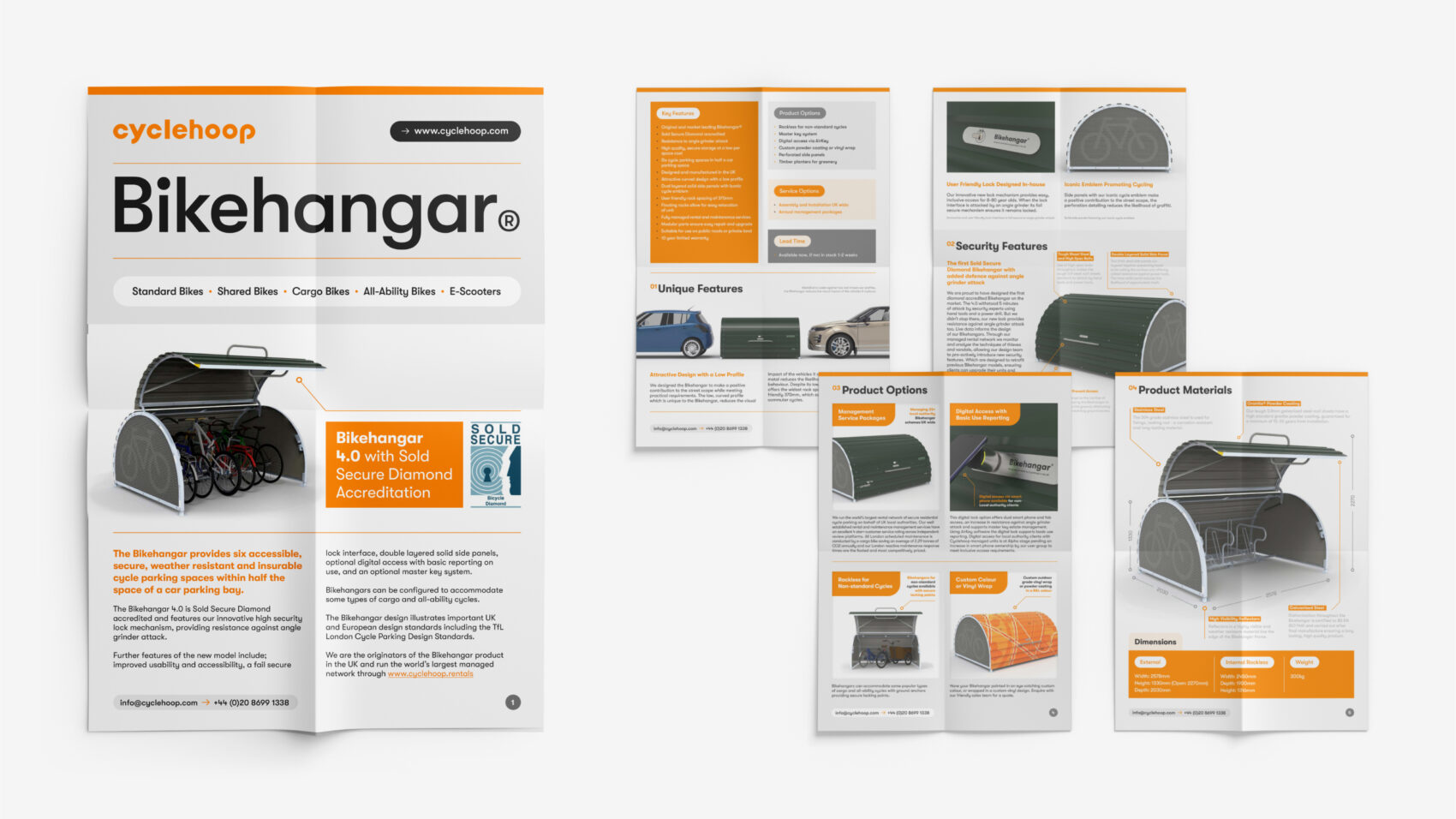
Brand continuity from digital to print
Cyclehoop utilises multiple creative outputs to reach prospective audiences. From social media to exhibition signage, we have outlined how the brand should be used on both print and digital applications. This includes specific graphic elements which work on both, including colour and typography. We have also allowed for the brand to be represented as closely as possible with reserved fonts which can work on Google and other platforms.
