RIPE
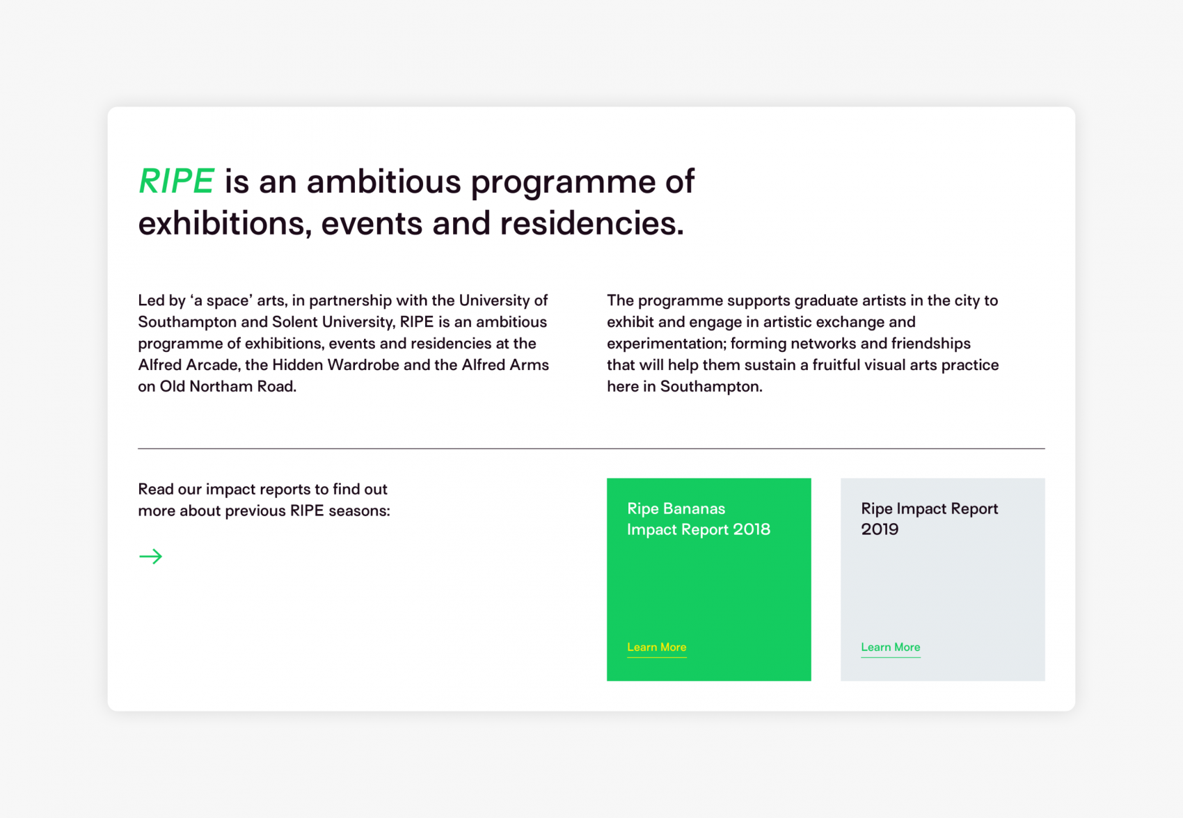
RIPE is a platform for graduate artists in Southampton, enabling them to exhibit and create work within a local network of artists to build and support a thriving visual arts community within the city.
Visit Site
RIPE is led by ‘a space’ arts and had primarily utilised social media as their base of online interaction up until the website creation.
Creating a website from scratch meant we had a clean slate to work with – a challenge we adore.
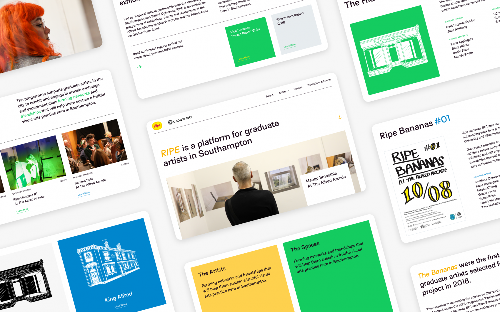
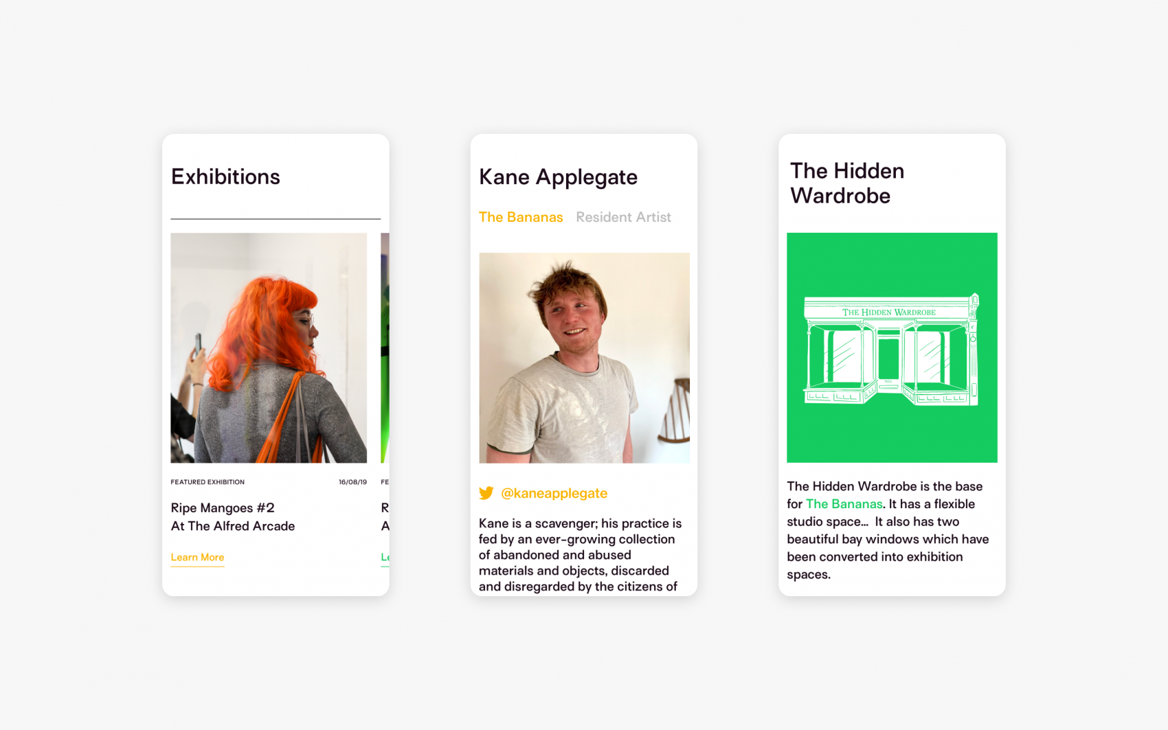
We wanted to build a site that drew ample attention to the incredible creative talent already on display at physical galleries, as well as attract emerging artists within a growing, diverse community. As such, it needed to blend a professional feel with the colourful, organic playfulness found in Artist’s studios.

Comprehensive Collaboration
However, design-based content was only one aspect we had to contend with. RIPE contains multiple teams, over multiple events, over multiple spaces – it’s not the easiest story to tell.
Thankfully, RIPE was open to our comprehensive and collaborative UX process. We discussed user flows, developed elaborative sitemaps and in-depth wireframes well before entering the design phase, creating an engaging and accessible user journey throughout.
Context For Creativity
Our first step in achieving this balance was to build a robust grid layout for all content, as well as distilling our type to a single font with uniform weight throughout. Why? Because it keeps things tidy.
By making the foundations of the site simple, we afforded the people to creating content for the site maximum creative expression, ensuring even their wildest pieces would work within the wider context of the user experience.
Colourful Content Creators
This project was unique in that the target audience, young creatives in Southampton, are the ones creating the content for the site. The design needed to represent them, understand their identity and build around them.
We decided to be bold, contrasting our super-clean grid design with a colour pallet based on fruit (something you’ll see in the existing RIPE exhibitions). We incorporated hand-drawn illustrations from one of their artists, embedded stickers and animations – all to build a site with RIPE’s mission in mind; creating a platform that invites creativity and individuality to shine.

Chaptr have a great eye for design and have been really great to work with. Our new RIPE website is contemporary, inviting and easy to navigate – it has definitely surpassed our expectations! The team have been really helpful and responsive, contributing ideas and creative solutions along the way.
Mia Delve, Creative Programme Officer, ‘a space’ arts
